Moving to a Single Column Layout
published 11/17/25
If this site has any type of design philosophy it is probably something like this:
Keep the site design simple and don't change it very much.
The site is basically black and white with shades of gray. It looks about the same as it did when I started it 14 years ago. Some minor evolutions happened over the years but not much.
Single Column Layout on Mobile
At some point I did a responsive design pass on the site so that when viewed on a narrow screen then the site wasn't broken. I added a mobile stylesheet that kicks it at a viewport of 800 pixels or less. The main thing that changed was moving the sidebar to the bottom. I tinkered a bit with spacing but not too much was actually different.
Fully Moving to a Single Column Layout
Recently I've been wanting to fully move to a single column layout even on larger displays. The sidebar is fine above the fold but on longer blog posts, once you start scrolling then you end up spending much of your reading time with the main column of content off-center. I hated this.
The most simple way to get things moved to a single column was to demote the
sidebar. I played around with this and ended up moving it in to the footer
element in the markup and thinking of it kinda like the big ass footers you see
on most sites.
Flexbox Makes it Easy
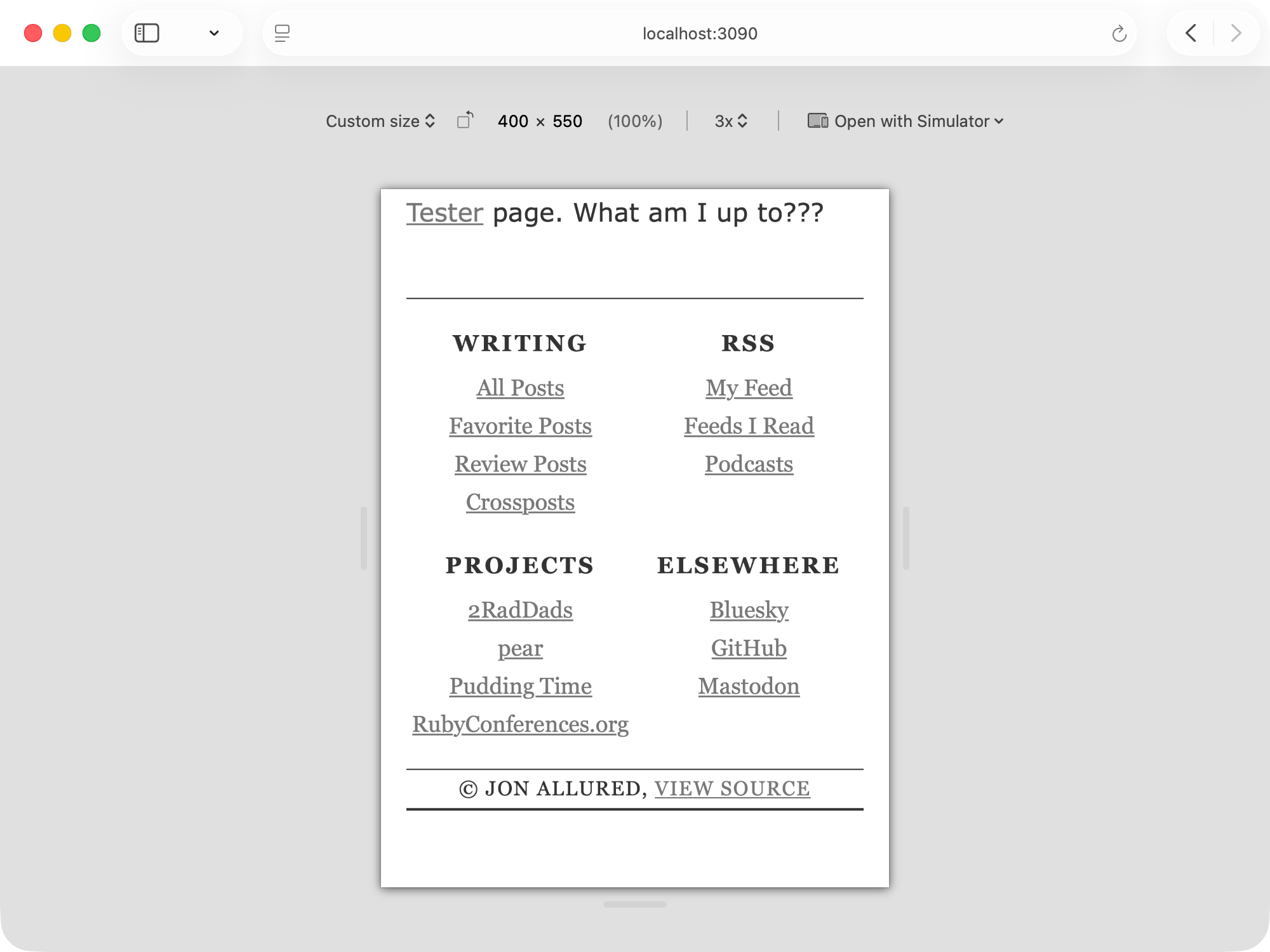
In terms of how to do this, I figured that I could use Flexbox to get what I wanted - 4 columns of footer items that collapse down to 2 columns at smaller viewport sizes. For the sake of simplicity the CSS is basically like this:
footer {
  nav {
    display: flex;
    flex-wrap: wrap;

    section {
      width: 25%
    }
  }
}

@media (min-width: 800px) {
  footer {
    nav
      setion {
        width: 50%
      }
    }
  }
}
And the markup looks something like this:
<footer>
  <nav>
    <section>
      <h2>Headline</h2>
      <ul>
        <li>item 1</li>
        <li>item 2</li>
        <li>item 3</li>
      </ul>
    </section>
    ...repeat...
  </nav>
</footer>
The approach is to organize things inside a nav with one section for each
type of sidebar content. Those each have an h2 and a ul. To style this I
turn on Flexbox with wrapping. The section elements default to 25% width but
then once we hit our breakpoint they expand to 50% causing 2 of them to wrap to
the next line.
Before and After
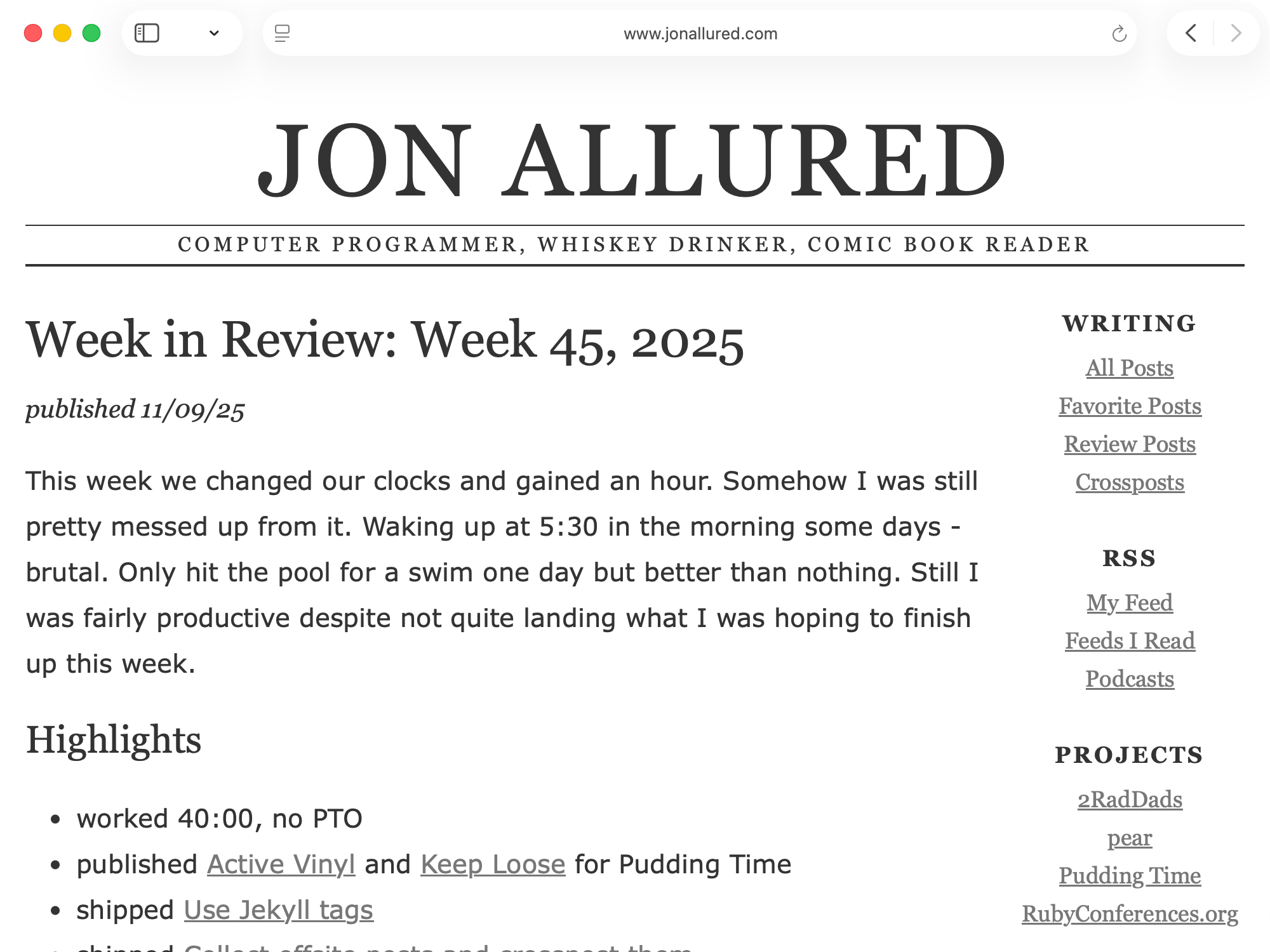
Now let's look at some before and after screenshots to help illustrate things. Here we have the before shot of the above the fold layout where the sidebar looks fine:
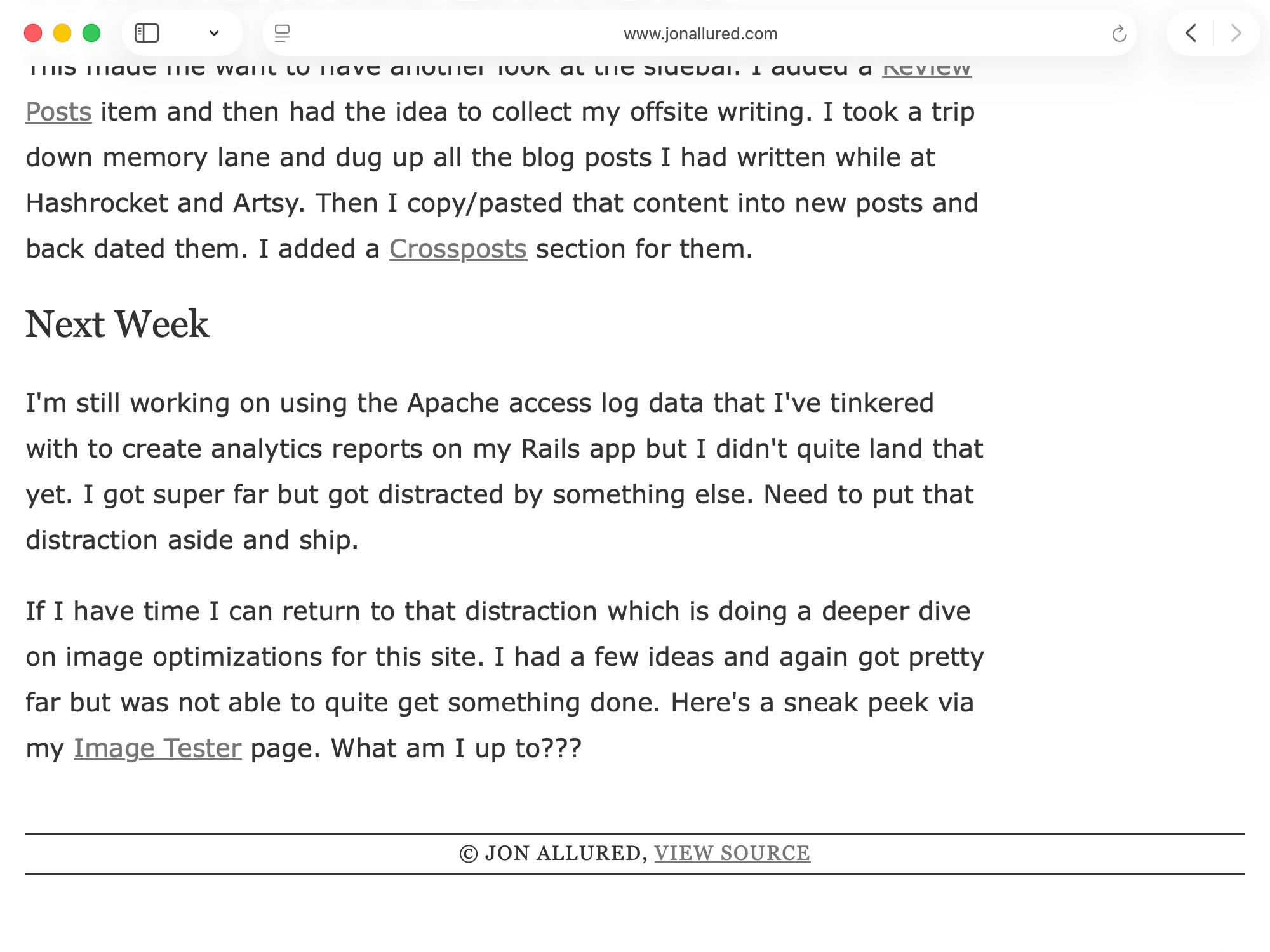
But then if we do scroll down to the bottom of the page then we see that the column of content looks awkward against the centered footer.
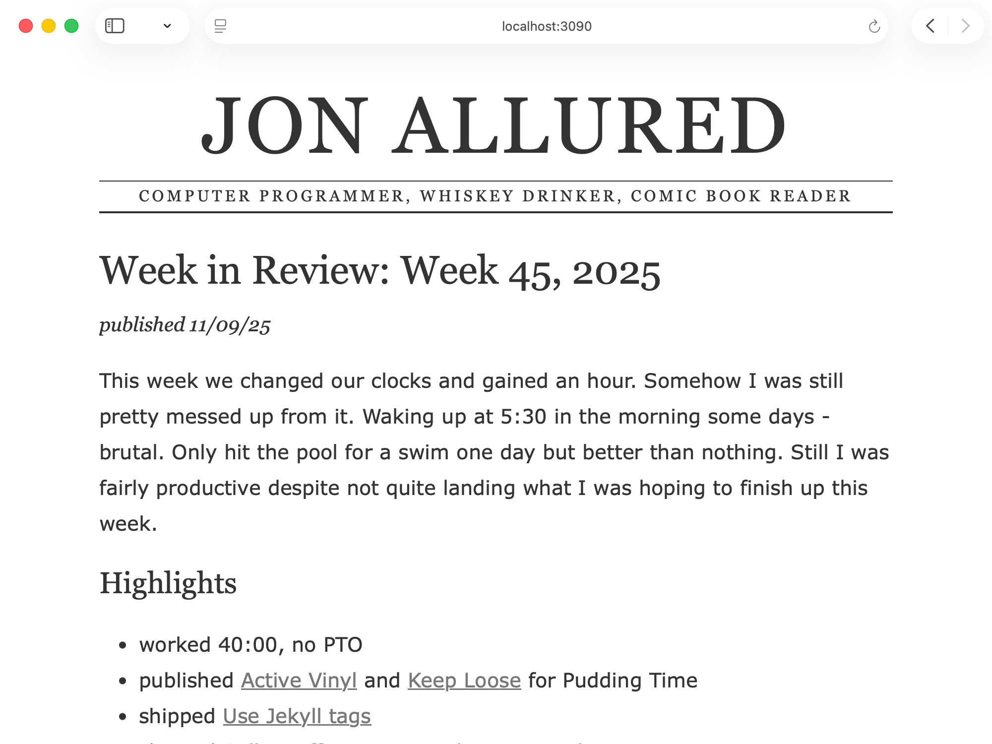
Now let's look at these after the move to a single column layout:
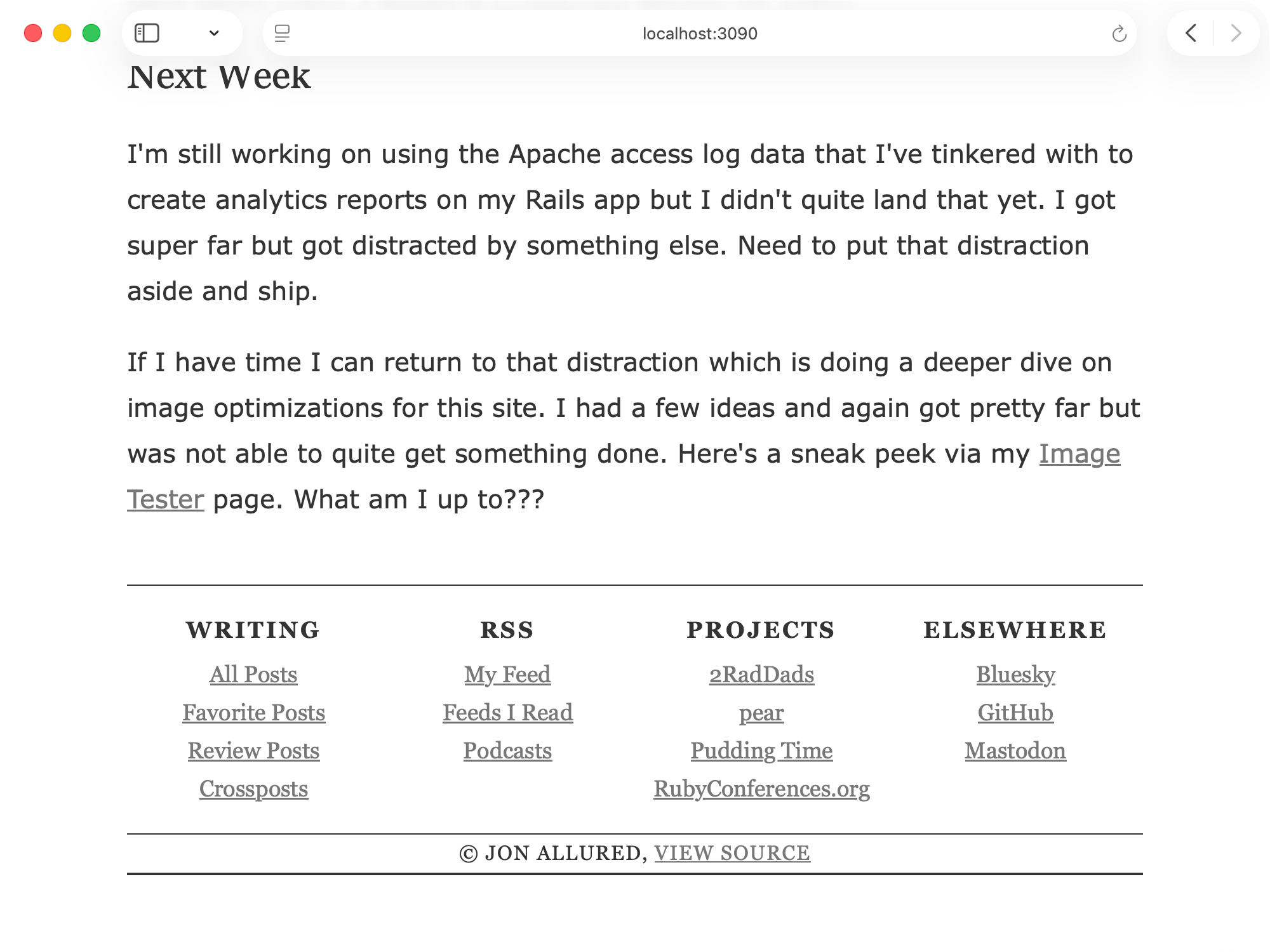
Here's where we see that sidebar content run in the footer with a 4 column layout:
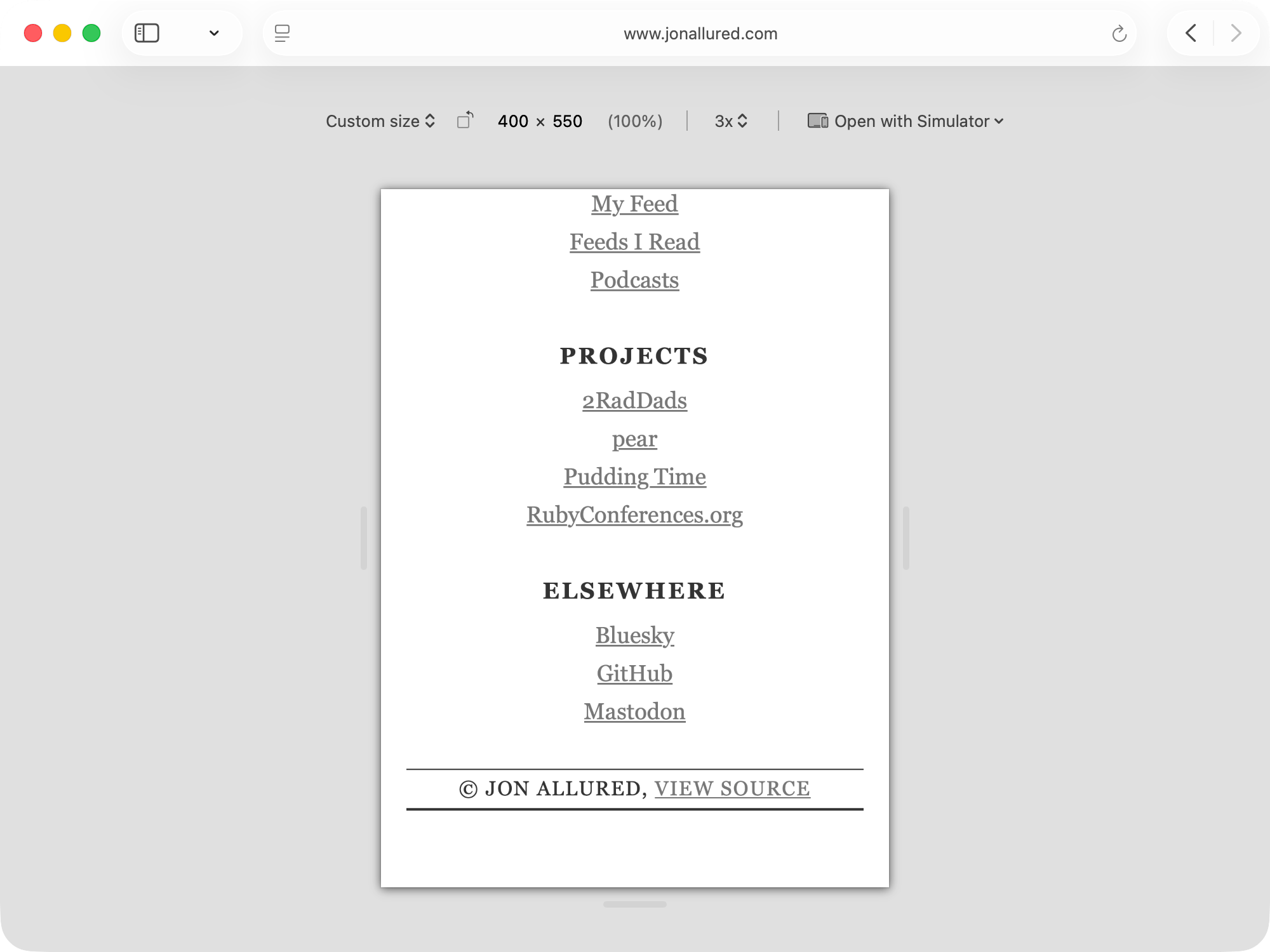
And for good measure here's how the site looked on a narrow screen before:
I like this much better:
Caching Woes
When I shipped this update I was excited to view it on my phone. I brought up the page and scrolled down to the bottom only to see obvious signs that the page was not loading the new CSS file. I refreshed a few times and it did not load the new file. Uh oh.
Turns out I need to improve my caching strategy for the site. I logged an issue for this and plan to hit it soon but I'm really trying to resist getting distracted by every little problem I hit. This is not easy!
Conclusion
Dropping from a max width of 1,000 pixels to 800 pixels seemed like a lot at first but I ended up thinking it was fine. The simplified layout of the site is easier to implement and I think it looks much nicer across all shapes and sizes of device. Hooray for reducing complexity!